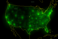
 A basic census plot. Really just a first effort, to show that I'm reading in the data properly and using workable settings to plot the data.
Census data is...
Goals here: 1) Demonstrate that it is possible to plot gobs of data on a single chart. 2) Show that useful information can be quickly derived by same, without needing to delve into extensive data analysis. 3) Make really cool pictures. 4) Get rich. (this last one is optional, but I won't object if a few dollars found there way into my pocket from this).
This is an extension of my work plotting Earthquake data
Some factors:
Census data, unlike earthquake data, is
limited to a small area of the globe, however I can still get away with
using Google Earth to render the map.
There is however the hiccup that more than 75% of the tiles I might by
default generate would be blank, wasting disk/bandwidth. This is not a
small chunk: Generating all tiles from levels 0 to 5 requires 2370
files (half of them .kml files, half of them png files). Given the
smaller area, I want to boost the detail another level, but that would
be a hideous 10922 files -- so I'll want to enhance my tool to smartly
handle blanks -- early 5th tier plots show 439 files
Census data has gobs of detail, but it's in a new file format with what
at first glance does not appear to be an easy way to parse it out by
anything other than state or county.
Census Data DOES have latitude and longitude, which saves on geocoding!
I was worried about having to parse out zip codes to do that...
Census Detail at the county level is a bit more focused than earthquake
data, I'll be able to shrink the 'point size' I use in rendering the
maps.
I tried using an 'area plot' for the census data, but wound up with
something unrealistic in the way of a map, whereas using the same
'volume plot' as I did for the earthquake data gives me something
usable.
Gamma: I'd been keeping the gamma value abnormally low value for
earthquakes, just to cope with how their values spread -- a handful of
really high values and a bunch of low values. Early results with the
census are showing a similar spread of values, so to keep straight
population maps more usable I'll want the same, but I will probably play
with it for some of the other maps census I have in mind.
A basic census plot. Really just a first effort, to show that I'm reading in the data properly and using workable settings to plot the data.
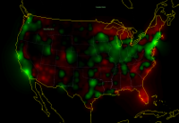 A basic housing plot.
While just a minor variation form the above, it shows a world more
detail. Red is housing vacancies above average, green is occupied homes
above average. Brightness reflects volume above/below averange, not
ratios. Quite likely ideal for someone doing market research in a
'where do we want to spend advertizing dollars / invest?' kind of way.
A basic housing plot.
While just a minor variation form the above, it shows a world more
detail. Red is housing vacancies above average, green is occupied homes
above average. Brightness reflects volume above/below averange, not
ratios. Quite likely ideal for someone doing market research in a
'where do we want to spend advertizing dollars / invest?' kind of way.
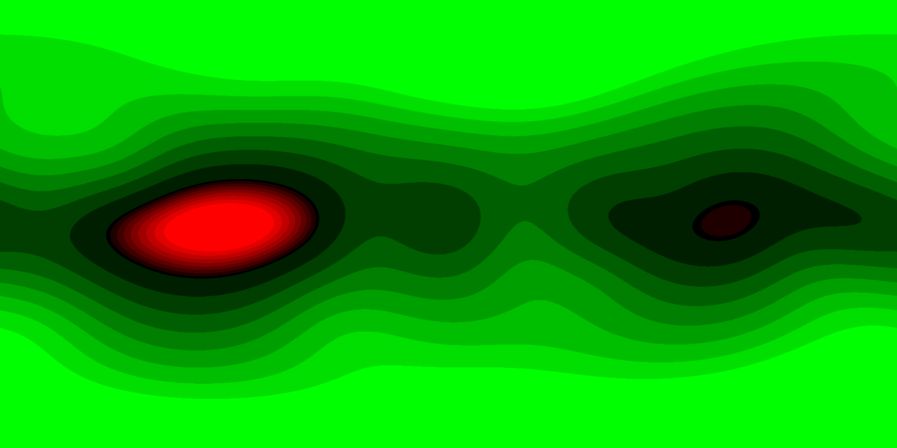 A plot of random data. Update: Looking back, it looks like Google Earth has issues today rendering the above plots. Just putting out an updated plot of random data (because getting and parsing the data is the real effort sink in creating these plots) for demonstration purposes. Its generated as if on a globe, using the Equirectangular Projection. Instead of black, we could be using transparency for a background
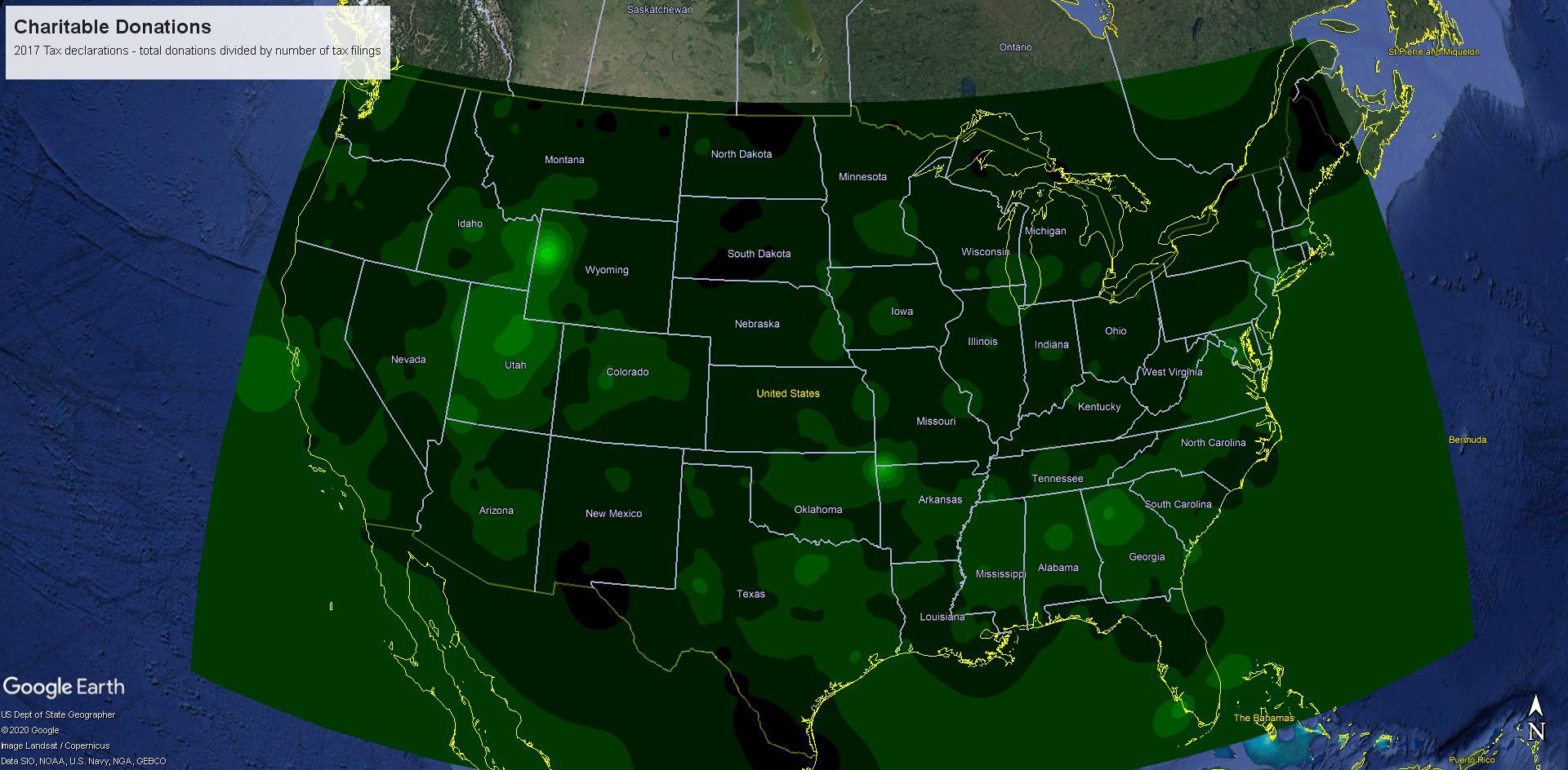 A plot of Charitable Donations taken from 2017 tax data. My oh my, South Dakota and Maine, whatever will we do with you... and Florida? What's your deal? This factors in local population, which at sea is 0, so it just extends trends at the coastline out to sea while courting div-by-zero. Ideally you use a mask to trim the plot at the coastline/borders. The plot was much faster to make than it was to get the data, and being fair, some liberty was taken with the data (it's operating on A19700 / N1 in 17zpallagi, so states where people tend to file individually instead of as couples will impact how the donations look. Ideally, I use population rather than # of tax filings, but my data lacks population numbers (not everyone files taxes)
 A third draft of covid data. Earlier plots suffered several render bugs (
whole map red? Sure, why not) which are now mostly fixed. Still need to deal with the single-death scenario (now in high-pop areas they're too minor to show, without something to give them a custom minimum render footprint). The image is an APNG file, an animated PNG. Google-earth has issues with them (read: Not supported), so I'm providing just the image. Bounds are 49.5N to 24N by 66W to 125.5W, Equirectangular Projection, so you should be able to just slot individual frames into a KML file. Data curtesy of github/covid-19
 A draft version of of plotting how quickly deaths rates are changing. Brightest reds: At least doubling every 10 days. Medium red: doubling between every 10 and 30 days. Dark red: Doubling slower than every 30 days, but growing. Brightest green: Halving every 10 days. medium: Halving every 10-30 days, darkest green, declining slower than by half every 30 days. Data curtesy of github/covid-19
Torrenal